Actipro WPF Controls 2013.1 have been released and is now available for download. This version adds a new full-size Charts product, a Metro Dark theme, a complete reimagining of the Sample Browser's UI, and some great new SyntaxEditor functionality.
Major new features are described below. See the announcement post for the detailed list of enhancements and updates.
Our new full-size Charts product has been added, allowing you to create stunning charts for your apps. See this announcement post and this first look post for a couple other chart screenshots.
Line Charts
A line chart renders quantitative data as a series of points connected by line segments. Lines can be straight, curved, or stepped. Markers can optionally be displayed based on type (such as first/last, high/low, negative, etc.).
Scatter Charts
Scatter charts render data points where each point is represented by a marker. Markers can use numerous built-in shapes or can be set to use custom shapes.
Area Charts
An area chart is a derivative of a line chart, where the area between the line and axis is filled in. As with line charts, areas can also be rendered using straight, curved, or stepped lines
Bar Charts
A bar chart displays rectangular bars with lengths proportional to the values they represent. Bar spacing can be set and the bars can be changed to render horizontally instead.
Indicators
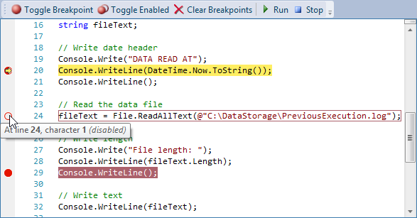
A rich object model for supporting indicators has been added. Indicators are special "tagged" regions of text that optionally display a glyph in the indicator margin and optionally highlight the text range with special styles. Built-in indicators include bookmarks, breakpoints, and current statement indicators. Custom indicators can easily be created as well.
See this bookmark indictors post and this debugging indicators post for much more detail on indicators and examples of functionality.
Line Terminator Backgrounds
When a style that has a background encompasses a line terminator, it now will render the background of the line terminator's virtual character.
A new property BackgroundSpansVirtualSpace property has been added to highlighting styles that when set to true, will extend the background over a line terminator to cover all the way to the right edge of the view.
Trim All Trailing Whitespace
A new edit action has been added to trim all trailing whitespace in the entire document, regardless of the current selection.
CollectionTagger<T> Enhancements
The CollectionTagger<T> class has received a large number of new methods that make it easier than ever to manage a collection of tagged regions.
.NET Languages Add-on - Text Formatting
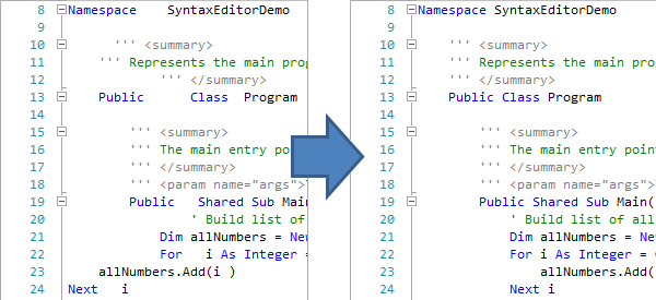
Text formatters have been added to the C# and VB languages in the .NET Languages Add-on, which beautify code by adjusting whitespace and making it more readable.
See this C# text formatter post and this VB text formatter post for more information and examples of the formatting results.
.NET Languages Add-on - Attribute IntelliPrompt
Full automated IntelliPrompt while editing C# and VB attributes is now included.
.NET Languages Add-on - Implicit Variable Type IntelliPrompt
Automated IntelliPrompt quick info now displays when hovering over var in C# or Dim in VB.
See this blog post for some more information and screenshots.
Metro Dark Theme
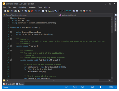
A Metro Dark theme has been implemented that renders similar to Visual Studio 2012's dark theme. This new theme affects all controls and even can apply to native WPF controls.
Actipro Themes for WPF now provides implementations of all system themes, three Office themes, and three Metro themes!
See this blog post showing several screenshots of the new Metro Dark theme in action.

![LineChartType_thumb[1] LineChartType_thumb[1]](https://files.actiprosoftware.com/images/blog-legacy/LineChartType_thumb1_thumb.png)
![ScatterChartType_thumb[1] ScatterChartType_thumb[1]](https://files.actiprosoftware.com/images/blog-legacy/ScatterChartType_thumb1_thumb.png)
![AreaStackedChartType_thumb[1] AreaStackedChartType_thumb[1]](https://files.actiprosoftware.com/images/blog-legacy/AreaStackedChartType_thumb1_thumb.png)
![BarStackedChartType_thumb[1] BarStackedChartType_thumb[1]](https://files.actiprosoftware.com/images/blog-legacy/BarStackedChartType_thumb1_thumb.png)


![AttributeIntelliPrompt_thumb[1] AttributeIntelliPrompt_thumb[1]](https://files.actiprosoftware.com/images/blog-legacy/AttributeIntelliPrompt_thumb1_thumb.png)


