Actipro WPF Controls v2020.1 development is in progress, and the new version’s main goals are to modernize our UI control features/themes, and make theme customization much easier.
In our previous post, we showed how our WPF samples application will be getting an integrated Source Code Viewer for browsing our samples source code. This feature was suggested by a customer.
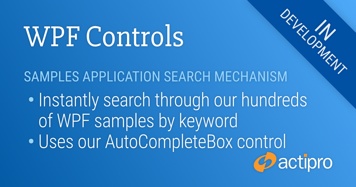
Another customer feature suggestion was for a way to quickly search for samples. We are also adding this in the 2020.1 samples application.
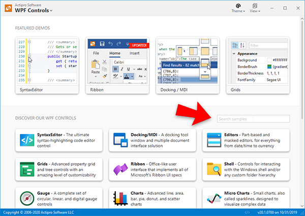
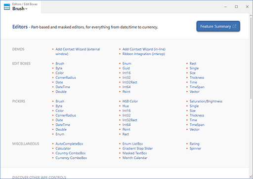
Searching for Samples
We’ve used the AutoCompleteBox in our WPF Editors to implement search functionality for locating samples.
The new "Search samples" box
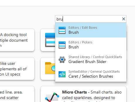
Simply type in text in the search box and a list of results will appear.
The popup showing samples with "bru" in their titles
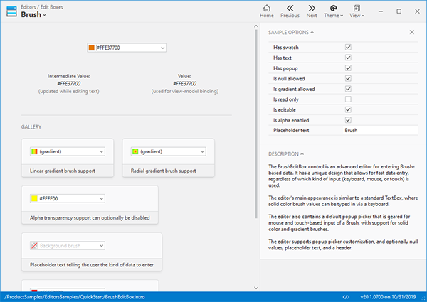
Select a result and the related sample will appear.
After selecting a sample, it immediately loads up
Summary
We appreciate all the customer feedback and hope this new v2020.1 feature will help you find what you are looking for faster than ever.
Post in the comments below if you have any feedback or questions about the new samples search mechanism.
Actipro WPF Controls v2020.1 development is in progress, and the new version’s main goals are to modernize our UI control features/themes, and make theme customization much easier.
In the previous post, we took a look at our redesigned WPF samples application that will launch in the 2020.1 version. The new design focuses on a modern aesthetic that makes great use of our themes-related updates for v2020.1.
One of the user comments in that post was that it would be great to support viewing of the sample’s code right from within the application. This is something we also planned on adding, so let’s see what that feature looks like.
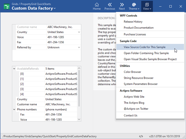
Viewing Sample Code
When you navigate to a sample, a “View Source Code for This Sample” menu item is available. We also have added a status bar button with a “</>” glyph that accesses the same feature.
The menu item to view sample source code
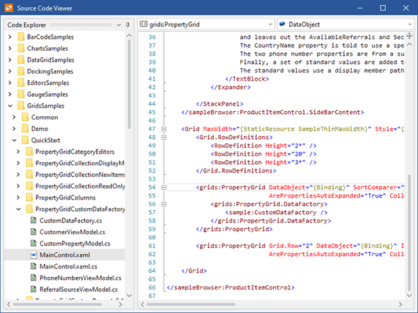
When clicked, the Source Code Viewer window will open and the selected sample’s main XAML code will be displayed by default.
The XAML source for the sample
The Source Code Viewer window opens as a separate window so that if you have a multi-monitor setup, you can display the code on a different monitor from the samples application itself.
The Source Code Viewer window has the full sample source folder hierarchy on the left. Select a different file from the same sample or a different sample altogether to see additional source code.
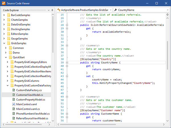
The C# source code for a class in the sample
Here we’ve selected a view-model C# class for the same sample.
Summary
This Source Code Viewer is a great example of combining multiple Actipro WPF products (Docking/MDI, Shell, and SyntaxEditor) together in a simple way to implement a professional-looking code explorer. We think this new feature in the v2020.1 samples application will be a real time-saver for our customers when wanting to learn more about how to use our WPF Control products.
Post in the comments below if you have any feedback or questions about the new Sample Code Viewer.
Actipro WPF Controls v2020.1 development is in progress, and the new version’s main goals are to modernize our UI control features/themes, and make theme customization much easier.
In the previous post, we took a look at the many updates made to modernize the appearance of our Ribbon product for v2020.1. Over the past several weeks, we've been hard at work completely redesigning the user interface of our WPF Controls samples application. This has been quite an effort since the application contains hundreds of samples in it. Let's dig in!
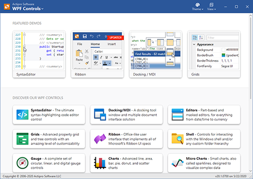
Reimagining the Samples Application Design
The new WPF Controls samples application design makes use of all our latest themes-related improvements in the 2020.1 version. Right from the start, you'll see our new WindowChrome title bar customization features in play. We've created a completely unique appearance for the title bar in this application, with the current location clearly listed on the left, and various other buttons (switching the app theme, quickly getting to the release history or other views, and so on) on the right side.
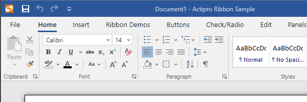
The sample application's home view
The home view features direct links to our most popular control demos at the very top. Or scroll down to click buttons that delve into each product, with many samples available for each.
The buttons here make use of our new ShadowChrome control that is added in v2020.1. ShadowChrome renders modern drop shadows and can be easily animated. In this case, we draw the button "upward" to the mouse by altering the shadow as you mouse over a button.
Another thing to notice here is that we've built vivid new icons for each of our WPF Control products, all in the fluent design style.
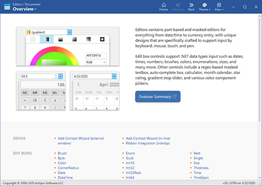
Let's click the "Editors" product button...
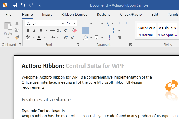
The Editors product overview
Each product overview provides one or more screenshot buttons that link directly to enticing samples of the product, and shows a brief description of the product. Scroll down to see the entire categorized list of links to available product samples.
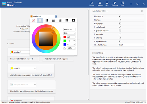
We'll click on the "Brush" edit box link...
The Brush edit box QuickStart
This screenshot is representative of what you'll find with many of our QuickStart samples. The control itself is displayed on the upper left. Various sample options to alter its appearance and behavior appear in the right sidebar, and a general description of the control is below that. We often show a gallery of example usage scenarios of controls as well.
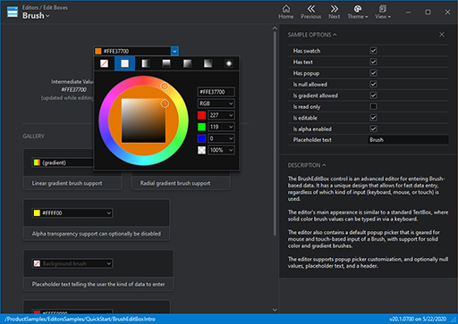
How does all this look if we change the application theme? Let's switch to a Metro dark theme:
The Brush edit box QuickStart in dark theme
Flipping back to the original theme, how can we quickly jump to another Editors sample or to another product's samples?
The Backstage for the Editors area
By clicking the button on the upper left that shows the current view location, a Backstage view is displayed. It lists all the samples for the current product in a categorized list. Or you can scroll down to see the list of products to easily jump to another product's samples. This Backstage feature is supported by our new WindowChrome overlay feature.
Summary
We've put a lot of effort into making a new clean, modern design for the samples application and we hope that you'll love using it once the 2020.1 version is released. It makes the entire presentation of the hundreds of samples in the application much more consistent and best of all, the XAML code-behind is now much easier to read.
Post in the comments below if you have any feedback or questions about the new samples application design.
Actipro WPF Controls v2020.1 development is in progress, and the new version’s main goals are to modernize our UI control features/themes, and make theme customization much easier.
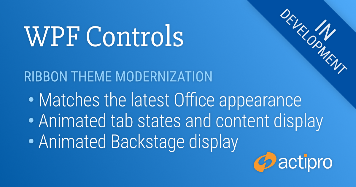
In the previous post, we showed off a new ShadowChrome control that is a decorator for rendering modern shadow effects. In today’s post, let’s have a look at some of the major work we’ve done on modernizing the appearance of our Ribbon product for v2020.1.
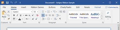
Comparing Appearances
For the 2020.1 version, we’ve gone through every Ribbon-related control and made style improvements to match the latest appearance found in Office 2019. Let’s see how the 2020.1 version’s theme compares to our current 2019.1 version’s theme:
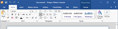
The new Ribbon 2020.1 appearanceThe current Ribbon 2019.1 appearance
You can see from the screenshots that there are subtle differences throughout. Whitespace has been adjusted, glyphs are now chevrons, the title bar background accent is more restrained, etc.
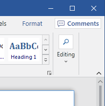
The right side of the Ribbon
Looking at the right side of the Ribbon, collapsed groups now render a bit differently from before. Contextual tab groups are more subtle. Tab row buttons like the Comments one in this screenshot have a new available style. And there is a built-in minimization button on the bottom-right.
Animated Tabs
We also wanted to provide fluid animations throughout the Ribbon, similar to Office. When you move your mouse over a tab, the underline animates to fill the tab.
Tab animations in action
When you select a new tab, the tab’s content animates into place with a quick slide.
Animated Backstage
Continuing on the animation front, we harnessed the great new WindowChrome overlay features that are coming in 2020.1 to host our Ribbon’s Backstage.
Backstage animation in action
This allows the Backstage to be fully animated on display as well.
Summary
We are still continuing to iterate on our themes for Ribbon and other products, but this should give you an idea of some of the fantastic themes updates coming in the new version.
Post in the comments below if you have any feedback or questions about the new Ribbon themes.
 Bill Henning (Actipro)
-
Bill Henning (Actipro)
-