WPF, Silverlight, and WinRT/XAML v2015.1 Released

by Avatar Bill Henning (Actipro)
Friday, April 3, 2015 at 2:31am

BlogPostBanner20151

The 2015.1 versions of our WPF, Silverlight, and WinRT/XAML controls have been released and are now available for download.

Major new features are described below.  See the announcement posts for the large detailed list of enhancements and updates, including many items not listed below:

ProductHeadingWinRTBarCodes

Our Bar Codes product has been ported to the WinRT XAML platform.  This product, which already exists on WPF and Silverlight, allows your apps to render vector-based bar codes using many common 2D and linear bar code symbologies.

BarCodes

A full set of demos and QuickStarts are included to help you get going.

ProductHeadingWPFDocking

The interop assembly that makes it easy to use Docking/MDI with the Prism framework has been updated to reference the latest Prism v5.0.

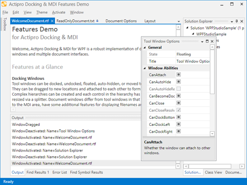
DockingMetro

We've made numerous layout and performance updates to further improve the product. 

We also have been working hard on building a completely new internal engine for the Docking/MDI product, which will be available sometime later this year.  Keep an eye on our blog for posts detailing the advanced features that are coming with those updates.

ProductHeadingWinRTEditors

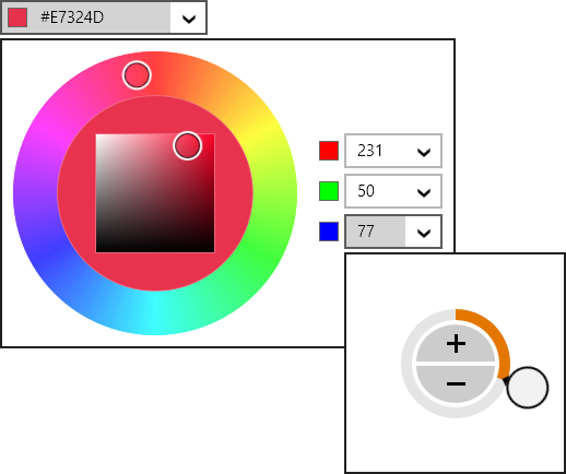
All of our edit box controls in the WinRT Editors now have an IsEditable property.  When set to false, the edit box behaves more like a ComboBox, while still retaining the rich popups that make the editors unique.  This is an ideal option for apps whose primary mode of interaction is expected to be touch.

ColorEditBoxNoAlpha

The CornerRadiusEditBox, PointEditBox, RectEditBox, SizeEditBox, and ThicknessEditBox controls have been updated to support text parsing one and/or two number entries where appropriate, which is useful for easy uniform value entry.

ThicknessEditBox

In the above ThicknessEditBox, a 2 is typed and then Enter is pressed.  The value is converted to a uniform thickness of 2.

A ValueChanged event has been added to all edit boxes, which fires when a value change is committed.

Finally, edit box padding has been adjusted so that more content is visible in the same amount of space.

ProductHeadingWPFGauge

A new DigitalGauge.CharacterSegmentThickness property allows for segment thickness adjustments.  This gives you even finer control over the presentation of your digital characters.

DigitGaugeSegmentThickness

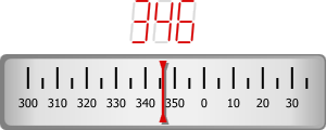
We've enhanced the 'Linear Gauge Rolling Scale' QuickStart with a new infinite rolling scale example for navigation headings.

HeadingGauge

ProductHeadingGenericSyntaxEditor

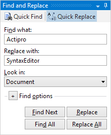
The EditorSearchView control now supports an optional "Find All" button.

EditorSearchView

The RTF export logic has been updated to support extended ASCII characters.

The free CSS language definition now supports the syntax highlighting of media queries.

We've dramatically improved the speed of large completion list display.

Several other performance improvements have been made, such as optimized the scenarios for which the TokenTagger raises its TagsChanged event, and refining of the automatic outlining update logic.

In the WinRT version, we added the SyntaxEditor.AreSelectionGrippersEnabled property, which determines whether the selection grippers show after touch within a view.

.NET Languages Add-on

The C# parser has been improved to recover better when encountering open block statements so that its AST node structure remains better in tact.

DotNetPropertyAccessor

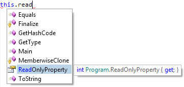
The IntelliPrompt quick info for properties now includes accessors, making it possible to see whether a property is read-only.

Python Language Add-on

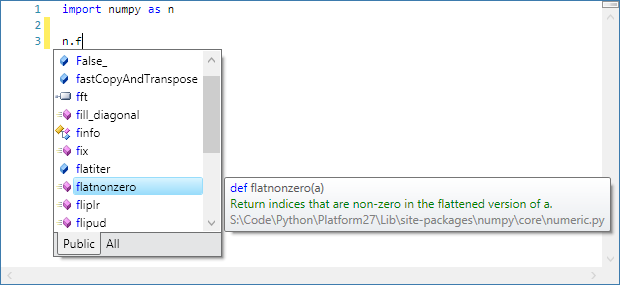
The Python language has received an enormous amount of updates, that in sum really improve the entire automated IntelliPrompt feature set.

PythonAddon

Check out all these enhancements:

  • Added IntelliPrompt for private members and updated the completion list to have Public and All filter tabs.
  • Added reflection data for private methods/fields of built-in primitive types.
  • Added IntelliPrompt for built-in exception types.
  • Improved IntelliPrompt for numerous built-in modules.
  • Greatly improved IntelliPrompt for package and module imports.
  • Improved IntelliPrompt for function parameters by examining available assert statement isinstance calls.
  • Added IntelliPrompt for static fields on classes.
  • Improved the resolution of base types for classes.
  • Added the optional IResolver.UnknownReturnTypeReferenceCallback callback that can be used to provide return type references for unknown types.
  • Updated the resolver to recognize where 'cls()' in a class method can create a new instance of the related class.
  • Updated the IntelliPrompt completion list to filter unmatched items.
  • Updated the IntelliPrompt docstring display to retain presentation of line feeds.

ProductHeadingGenericViews

The Views product has a new TaskBoard control added, available in all three (WPF, Silverlight, and WinRT) platforms.  TaskBoard can be used to create a board of reorderable columns and cards.  All of the drags use smooth animations to give you the feel that you are really interacting with the object.

RepairShopScheduling

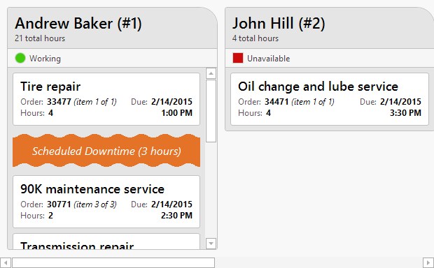
The first full-source sample that comes with the control is a Repair Shop Scheduling demo, which shows how a TaskBoard can be used to interactively schedule work to resources, such as employees. TaskBoard excels at providing a visual way of representing work/tasks (displayed as cards) within a queue of some sort (displayed as a column).

PageBannerDefault

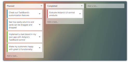
The second sample is a Task Planning demo, which shows how a TaskBoard can visually organize a project's tasks.

ProductHeadingGenericShared

We've added another new primitive SemiEllipse shape, which renders half of an ellipse.

SemiEllipseShape

The existing Triangle shape has a new IsClosed property that when set to false will create a triangle with only two of the sides rendered.

TriangleShape

Finally, in the WPF Shared Library, we added GradientBrushSlider.CanAddStops and CanRemoveStops properties that determine whether stops can be added and removed from a GradientBrushSlider.


TaskDownload TaskLiveDemo TaskBuyNow

Docking/MDI vNext - Tool Window Title Bar

by Avatar Bill Henning (Actipro)
Friday, March 6, 2015 at 1:02pm

PostBannerWPFControlsDevNotes

As mentioned in this previous post, we've been looking for ideas to further improve our WPF Docking/MDI product, which already is the market leader for docking tool window and MDI functionality.  We've committed to working on a complete internal restructuring of the product that we will call Docking/MDI vNext.  We're doing our best to keep the same general API surface, while providing even more advanced features in every area of the product.  We've collected suggestions from our customers over the past several years and are working to meet them as best we can with Docking/MDI vNext.

In today's post, I'd like to discuss a feature that has been requested by customers: tool window container title bar customizations.

Feature Description

There have been certain scenarios where a customer has wanted to add custom buttons or content into the tool window container title bar.  In the past, you could achieve this by making a clone of the ToolWindowContainer style/template and altering it to include your custom UI in the title bar area.  This works but is tedious and we wanted to make this sort of thing very easy to do for vNext.

In vNext, each ToolWindow now has a ContainerTitleBarContentTemplate property that can be set to a DataTemplate to show in the tool window container title bars.  This can be a button, a label, or any other UI element you can think of.

Usage Example

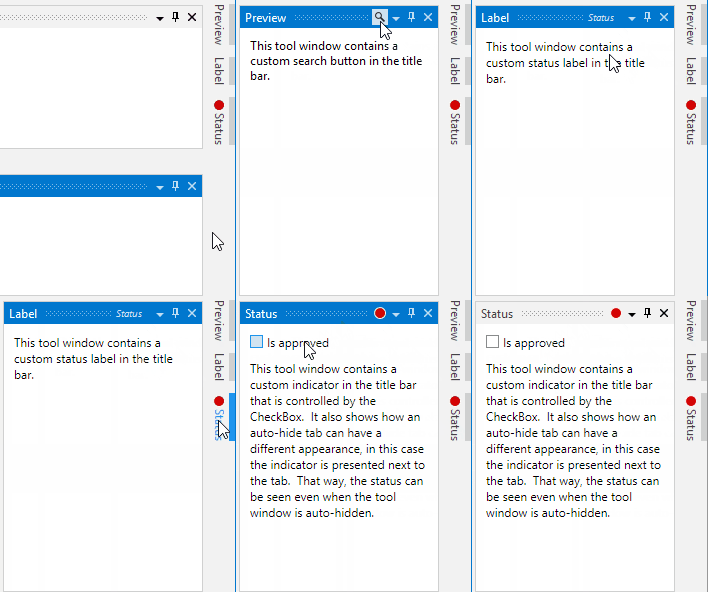
In this animated example, we show three auto-hide windows.  Each has custom content in the title bar.  The "Preview" tool window has a search button that renders with the same style as the other buttons.  The "Label" tool window has a status label in the title bar that currently says "Status" but could be data bound to a property. 

ToolWindowTitleBars

The "Status" tool window shows a custom circle indicator that says whether the "Is Approved" CheckBox is checked.  When the CheckBox is toggled, it updates a value in the tool window's data context and the indicator changes to another color.

As a bonus, we're also showing how custom content can be injected into auto-hide tabs.  The indicator for the "Status" tool window also appears there and updates live as well.

Summary

These are just some of the really advanced features we're adding to the product for vNext.

Docking/MDI vNext is currently still in early development stages but is progressing very well.  Please contact us via email if you are an existing customer and would like to sign up as a beta tester for vNext.  If you have any other suggestions for improving Docking/MDI, now is the time to get them in.  We'll post more updates on our vNext improvements soon.

In the meantime, please download our current Docking/MDI control product and give it a spin.

TaskDownload TaskLiveDemo TaskBuyNow

Docking/MDI vNext - Docked Size Constraints

by Avatar Bill Henning (Actipro)
Friday, February 27, 2015 at 10:13am

PostBannerWPFControlsDevNotes

As mentioned in this previous post, we've been looking for ideas to further improve our WPF Docking/MDI product, which already is the market leader for docking tool window and MDI functionality.  We've committed to working on a complete internal restructuring of the product that we will call Docking/MDI vNext.  We're doing our best to keep the same general API surface, while providing even more advanced features in every area of the product.  We've collected suggestions from our customers over the past several years and are working to meet them as best we can with Docking/MDI vNext.

In today's post, I'd like to discuss a feature that has been heavily requested by customers over the years: docked size constraints.

Feature Description

In the current Docking/MDI product, there is a minimum size that docked tool windows can become but it is hardcoded.  We've had customers request the ability to configure a minimum size for certain tool windows.  Other customers have also requested the ability to set a maximum size.  Yet others would like to see fixed size tool windows.  None of those scenarios are currently supported.  Docking/MDI vNext changes that.

In Docking/MDI vNext, you're able to optionally specify minimum and maximum docked sizes for each tool window.  We've written a lot of complex logic to support this feature in our layouts.  As the DockSite changes size, the tool windows all reflow and do their best to adhere to the docked size constraints that have been given.  It works very nicely.

Want to have a fixed size tool window?  This can be achieved by simply setting the minimum docked size to be the same as the maximum docked size.

Best of all, splitting (also reimplemented for vNext) is fully aware of the constraints and won't let you drag splitters beyond what the the size constraints allow.

Usage Example

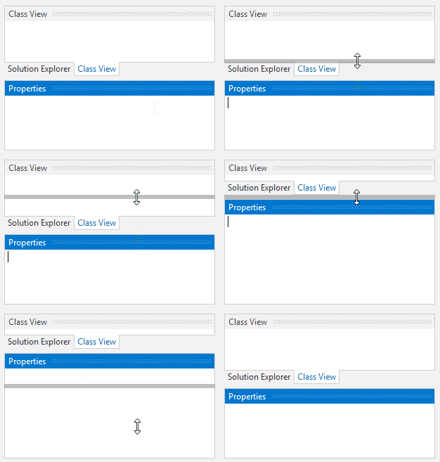
Let's have a look at how constraints work with splitters.  In the screenshot below, I've turned off live splitting so that we can see the splitter drag highlights.  In this layout, the Properties tool window has a minimum docked size constraint set.

DockedSizeConstraints

As the mouse drags the splitter upward, you can see how the class view is allowed to become very short and the splitter is still tracking with the mouse.

Later, the mouse is dragging downward but the splitter has reached the point where the minimum constraint of the Properties tool window is.  Thus the mouse cursor is down below the splitter (I kept moving the mouse down), showing that the splitter can't go any further in that direction.

Summary

This is a great feature that we've spent a lot of time on for Docking/MDI vNext.  vNext is currently still in early development stages but is progressing very well.  Please contact us via email if you are an existing customer and would like to sign up as a beta tester for vNext.

If you have any other suggestions for improving Docking/MDI, now is the time to get them in.  We'll post more updates on our vNext improvements soon.

In the meantime, please download our current Docking/MDI control product and give it a spin.

TaskDownload TaskLiveDemo TaskBuyNow

SyntaxEditor - ASP-Style Server Tags with IntelliPrompt

by Avatar Bill Henning (Actipro)
Friday, February 13, 2015 at 1:25pm

PostBannerSyntaxEditorDevNotes

We've had a lot of customers throughout the years ask us for a sample that could show how to harness our SyntaxEditor .NET Languages Add-on and its automated IntelliPrompt within an ASP-style server tag context.  This is especially useful for any sort of template generating scenario.

We had an internal sample that we would send customers upon request, but several months back, we cleaned it up, enhanced it, and added it as a new QuickStart sample.  In this post, let's have a look at the QuickStart sample that was added to the SyntaxEditor for (WPF, Silverlight, and WinRT/XAML platforms) in the 2014.2 version showing how to achieve automated IntelliPrompt within ASP-style server tags.

Usage Example

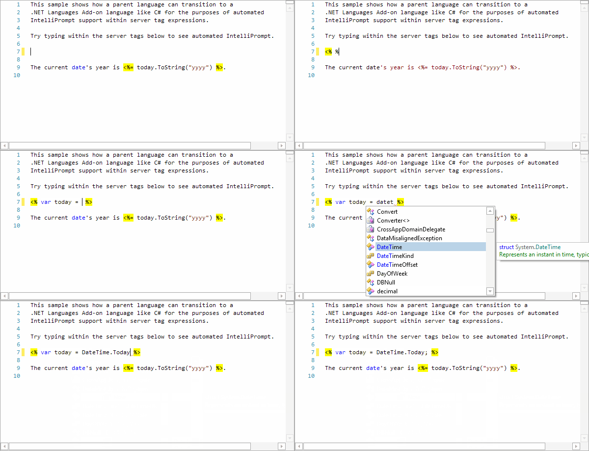
In the animated presentation below, you can see how there is a basic parent language whose lexer only knows to tokenize and color the word "date" as a keyword.  In real-world usage, the lexer could be made to fully colorize the text like normal.  The lexer has hooks that cause a transition to the C# language found in our .NET Languages Add-on when ASP-style delimiters are encountered.

SyntaxEditorServerTags

Both <% %> and <%= %> style tags are shown in this example.  What happens behind the scenes is that the parent language's parser will code generate C# code.  It will make a C# class named "__Generated" and a method named "__WriteOutput".  All the text of the parent language is output within "Response.Write" method calls.  C# code in the server tags is injected directly.  The resulting full C# code is placed in a separate in-memory document and parsed.  Finally the resulting parse data is returned, along with mapping data to know how offsets between the server tag range in the source document and those in the parsed C# document align.

Then there are several customized C# IntelliPrompt providers that know how to use that mapping data and translate offsets so that automated IntelliPrompt is fully functional within the server tag regions of the main source document, yet based on the generated C# code.

Tricky stuff, but it works great!

Summary

The full source sample described above was added in the first v2014.2 release of our WPF, Silverlight, and WinRT/XAML controls and is available for you to check out.

TaskDownload TaskLiveDemo TaskBuyNow

SyntaxEditor - XML End Tag Completion

by Avatar Bill Henning (Actipro)
Friday, January 30, 2015 at 9:59am

PostBannerSyntaxEditorDevNotes

Let's have a look at a new feature that came to the advanced XML language for SyntaxEditor for WPF (via its Web Languages Add-on) in the latest 2014.2 maintenance release: the ability to auto-complete XML end tags.

Feature Description

The advanced XML language already has auto-end tag insertion features that occur as you type the > character at the end of a start tag.  In that scenario, the end tag is inserted immediately after the caret.  There are other times where you have deleted some text that may include an end tag that you wish to type back in again.

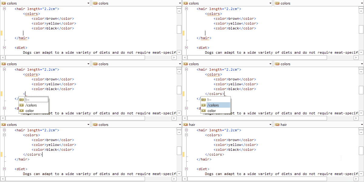
Say that you are editing a block of XML and start to type an end tag.  After typing the < character, the completion list will contain an item for closing the nearest open ancestor element (if any):

SyntaxEditorEndTagAutoComplete1

In the example above, you can see the "/colors" item in the completion list and how selecting it auto-completes the end tag.

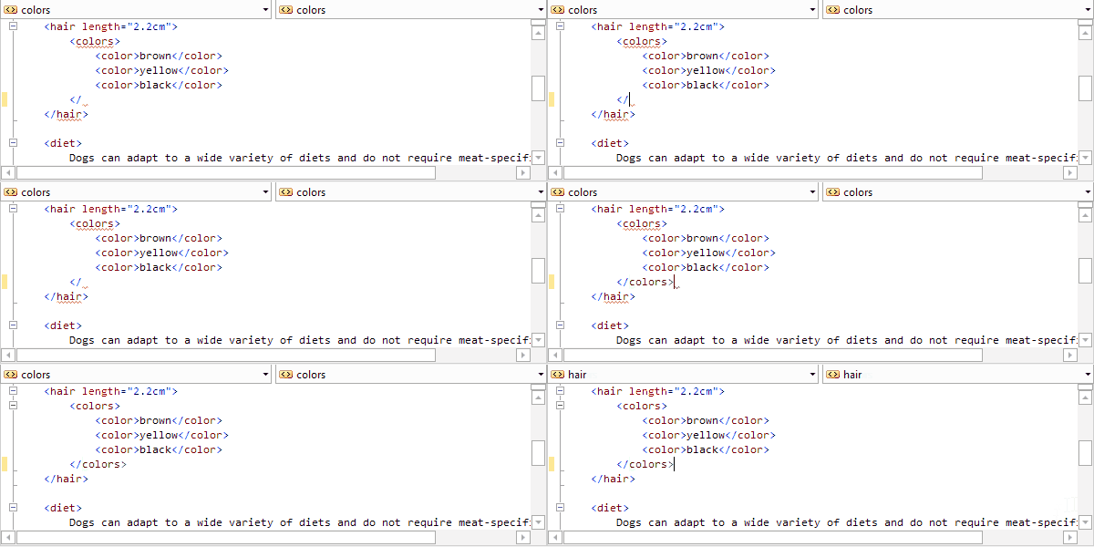
End tag auto-completion also works if you put the caret after a </ and press Ctrl+Space, as in this example:

SyntaxEditorEndTagAutoComplete2

In the example above, Ctrl+Space is pressed at the caret's location to auto-complete the "colors>" text.

Summary

The features described above were added in the latest v2014.2 maintenance releases of our WPF Controls and are available for use.

TaskDownload TaskLiveDemo TaskBuyNow