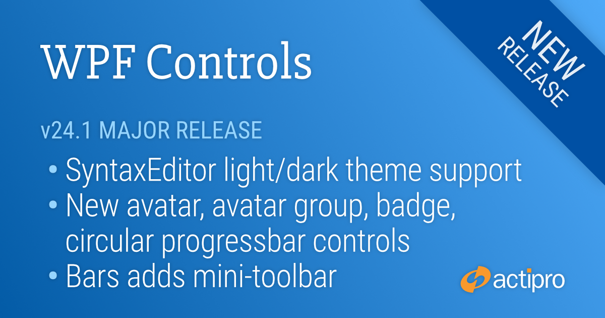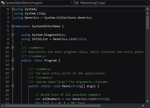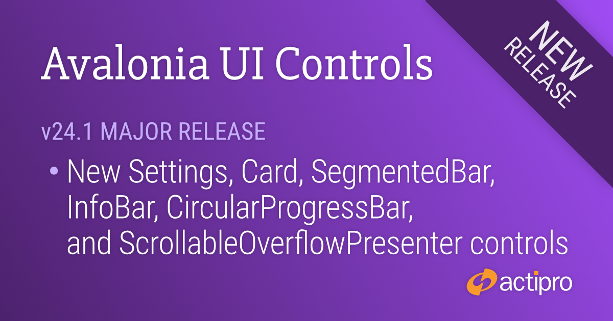
This version adds several great new controls and makes many updates across the Avalonia UI control product line.
See the related announcement post for the detailed list of enhancements and updates.
Here’s a look at some of the new features.
Fundamentals
Settings
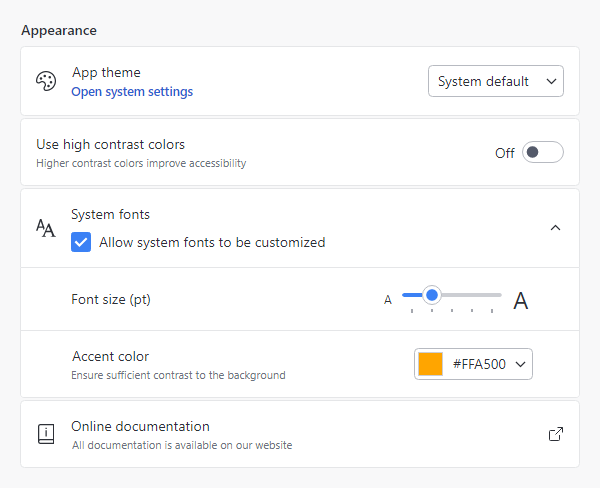
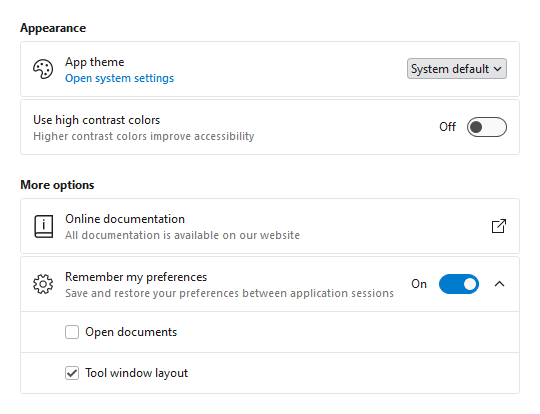
Most applications contain a window or view where end users can configure settings. Actipro now provides several controls for displaying grouped and optionally expandable card-based editors for settings that are presented in a consistent, easy-to-use way.
- Consistent Appearance - Cards have a uniform design, and related cards can be grouped together. Each setting card can optionally have an icon, header, description, and content.
- Card Contents - A setting card's content is generally an editor for the setting. The content may be left blank, and the card itself can be made into a clickable button.
- Flexible Editors - Each setting card can contain any kind of editor control. Switches, sliders, combo boxes, and text boxes are commonly-used editor controls.
- Expandable Sections - Some settings have numerous child settings. These indented settings may be hidden under expandable cards that animate the contents when opened.
Application settings have never looked so good!
Card
The new card control presents visually grouped information for a single subject, using optional cover, thumbnail, header, and footer sections.
Cards can optionally be actionable as well.
Segmented Bar
The new segmented bar control allows a user to select a single item with support for fluent animations when changing selection.
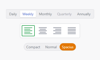
It can arrange items horizontally or vertically.
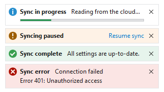
Info Bar
The new info bar control displays essential information to a user without disrupting the user flow.
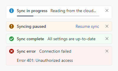
Messages can display with optional severity, action, and more.
Circular Progressbar
The new circular progressbar control displays a ranged progress value using fluent animations. It is similar to a native linear progressbar, except that it renders the progress in a ring shape and shows the progress text within the ring.
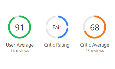
An indeterminate state is supported for scenarios where no specific progress value can yet be determined.
Shared Library
Scrollable Overflow Presenter
The new scrollable overflow presenter control can be oriented horizontally or vertically and displays scroll buttons when its content overflows the available space.

Clicking a scroll button smoothly scrolls the content.
Themes
Toggle Switch Affinity
Toggle switches can now optionally arrange the knob/track on the right side of the control instead of the left, which is ideal when used in the new settings-related controls.
Avalonia
The minimum Avalonia UI dependency is updated from v11.0.5 to v11.0.7 and all native control themes should now be consistent with Avalonia UI’s theme updates through v11.0.10.