 Bill Henning (Actipro)
This version brings the Bars product and its ribbon control out of beta, adds many new controls to the Shared Library, adds support for easy toggling of SyntaxEditor light/dark themes, improves the .NET Languages Add-on, makes UIA peer updates for .NET 8, and much more.
See the related announcement post for the detailed list of enhancements and updates.
Here’s a look at some of the new features.
Bars
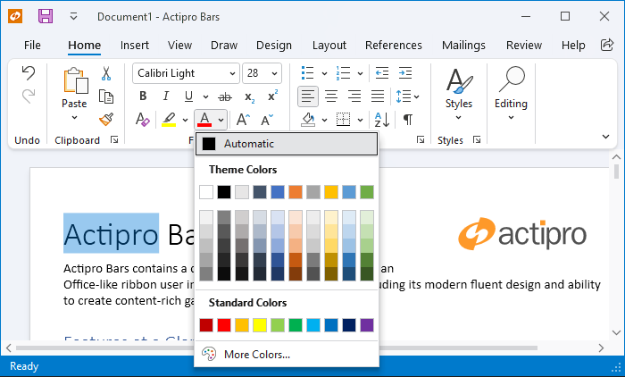
The Bars product and its ribbon control have exited beta status. Bars is intended to replace the older Ribbon product, which is now deprecated but will continue to ship. We encourage customers to migrate to Bars over time, since it has a much better API that is designed to support both MVVM and XAML usage, and with a much more modern appearance.
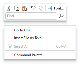
Mini-Toolbar
A mini-toolbar control has been added to Bars that can be displayed in a context menu.
Ribbon Group Multi-Row Layouts
Due to customer feedback, we moved ribbon group multi-row layout functionality out into a new RibbonMultiRowControlGroup control.
This allows for even more advanced layouts where multi-row buttons can be displayed next to other full height controls.
Shared Library
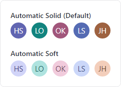
Avatar
The new avatar controls are used to represent people or objects. They can render a full-size image, a centered glyph, a person's initials, or text.
Avatar Group
Avatar group controls can render multiple avatar controls with configurable overlap and overflow features.
AvatarGroup with image-based avatars and some items overflowed
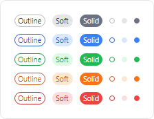
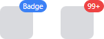
Badge and Numeric Badge
The new badge and numeric badge controls provide contextual information for other elements, and can also be used on their own.
Badge can display any content (e.g., “New!”) or can render as a dot. A displayed badge can be positioned anywhere on a target element and can pop into place with animation when shown.
Numeric badge is derived from the core badge control and is built for displaying a numeric count value. When the count value exceeds a given threshold, it displays an overflow string (i.e., "99+").
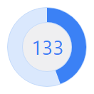
Circular Progressbar
The new circular progressbar control displays a ranged progress value using fluent animations. It is similar to a native linear progressbar, except that it renders the progress in a ring shape, and shows the progress text within the ring.
An indeterminate state is supported for scenarios where no specific progress value can yet be determined.
User Prompt Builder
A class to facilitate using the builder pattern to simplify creating and showing prompts based on UserPromptControl has been added.
var result = UserPromptBuilder.Configure()
	.WithHeaderContent("Overwrite existing file?")
	.WithContent("The specified file already exists. Do you want to overwrite the file?")
	.WithStandardButtons(UserPromptStandardButtons.YesNo)
	.WithStatusImage(UserPromptStandardImage.Question)
	.Show();
SyntaxEditor
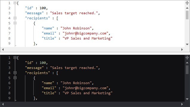
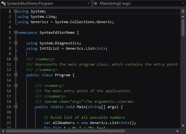
Light and Dark Themes
It’s easier than ever to support switching between light and dark themes in SyntaxEditor. A new class helps orchestrate updating SyntaxEditor UI elements, highlighting styles, and icon sets when toggling between light and dark themes.
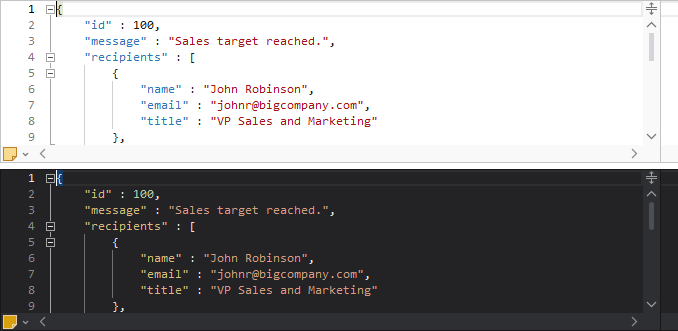
All Actipro-provided syntax languages now include both light and dark highlighting styles, and we automatically convert many popular light-themed colors to appropriate dark-themed colors for custom languages that have yet to be updated with explicit dark styles.
Highlighting Styles
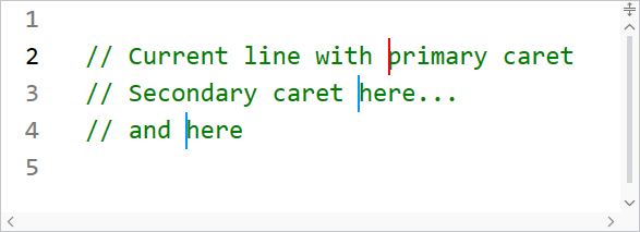
The current line number is now highlighted in a different style than other line numbers, so the default line number colors have been updated to better suit this feature.

When using multiple carets while editing, the primary caret now has a more distinctive appearance than secondary carets.
Several other highlighting styles have also had their default values tweaked.
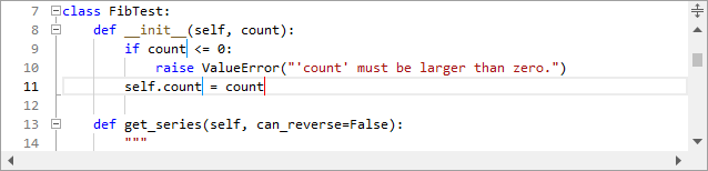
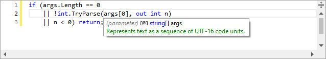
.NET Languages Add-on
The C# parser grammar has been updated to support C# 9.0 syntax, including everything from top-level statements to records and improved pattern matching.
Resolver support has been improved for local functions.
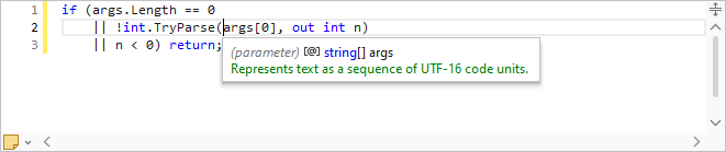
Documentation comments display in IntelliPrompt now supports <para> and <br/> tags for paragraph and line breaks.
.NET 8 Support
The WPF Controls officially support .NET 8 with this release.
UIA peers have been updated and added for numerous controls to better support accessibility updates in .NET 8.
Sample Browser
The Sample Browser application has been updated to use an SDK-style project and target .NET 6.