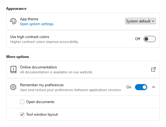
Settings groups, expanders, and cards used for application settings UI
Most applications contain a window or view where end users can configure settings. Actipro now provides several controls for displaying grouped and optionally expandable card-based editors for settings that are presented in a consistent, easy-to-use way.
Consistent Appearance - Cards have a uniform design, and related cards can be grouped together. Each setting card can optionally have an icon, header, description, and content.
Card Contents - A setting card's content is generally an editor for the setting. The content may be left blank, and the card itself can be made into a clickable button.
Flexible Editors - Each setting card can contain any kind of editor control. Switches, sliders, combo boxes, and text boxes are commonly-used editor controls.
Expandable Sections - Some settings have numerous child settings. These indented settings may be hidden under expandable cards that animate the contents when opened.
Application settings have never looked so good!
Shared Library
Card
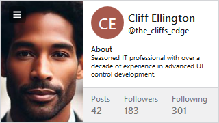
The new Card control presents visually grouped information for a single subject, using optional cover, thumbnail, header, and footer sections.
A profile card with multiple sections
Cards can optionally be actionable and even support built-in integration with badges.
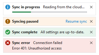
InfoBar
Various kinds of info bar severities
The new InfoBar control displays essential information to a user without disrupting the user flow. Messages can display with optional severity, action, and more.
Bars
Many updates have been made to the Bars controls to further improve features and functionality.
This version brings the Bars product and its ribbon control out of beta, adds many new controls to the Shared Library, adds support for easy toggling of SyntaxEditor light/dark themes, improves the .NET Languages Add-on, makes UIA peer updates for .NET 8, and much more.
See the related announcement post for the detailed list of enhancements and updates.
The Bars product and its ribbon control have exited beta status. Bars is intended to replace the older Ribbon product, which is now deprecated but will continue to ship. We encourage customers to migrate to Bars over time, since it has a much better API that is designed to support both MVVM and XAML usage, and with a much more modern appearance.
Mini-Toolbar
A mini-toolbar control has been added to Bars that can be displayed in a context menu.
A mini-toolbar with two rows, displayed above a context menu
Ribbon Group Multi-Row Layouts
Due to customer feedback, we moved ribbon group multi-row layout functionality out into a new RibbonMultiRowControlGroup control.
A multi-row layout with a full-height Table button all in the same ribbon group
This allows for even more advanced layouts where multi-row buttons can be displayed next to other full height controls.
Shared Library
Avatar
The new avatar controls are used to represent people or objects. They can render a full-size image, a centered glyph, a person's initials, or text.
Avatars with generic profile glyph, text initials, and image
Avatar Group
Avatar group controls can render multiple avatar controls with configurable overlap and overflow features.
AvatarGroup with image-based avatars and some items overflowed
Badge and Numeric Badge
The new badge and numeric badge controls provide contextual information for other elements, and can also be used on their own.
Badge and NumericBadge controls displayed as adorners to an element
Badge can display any content (e.g., “New!”) or can render as a dot. A displayed badge can be positioned anywhere on a target element and can pop into place with animation when shown.
Numeric badge is derived from the core badge control and is built for displaying a numeric count value. When the count value exceeds a given threshold, it displays an overflow string (i.e., "99+").
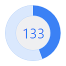
Circular Progressbar
The new circular progressbar control displays a ranged progress value using fluent animations. It is similar to a native linear progressbar, except that it renders the progress in a ring shape, and shows the progress text within the ring.
Circular progressbars can be an integral part of a dashboard display
An indeterminate state is supported for scenarios where no specific progress value can yet be determined.
User Prompt Builder
A class to facilitate using the builder pattern to simplify creating and showing prompts based on UserPromptControl has been added.
var result = UserPromptBuilder.Configure()
	.WithHeaderContent("Overwrite existing file?")
	.WithContent("The specified file already exists. Do you want to overwrite the file?")
	.WithStandardButtons(UserPromptStandardButtons.YesNo)
	.WithStatusImage(UserPromptStandardImage.Question)
	.Show();
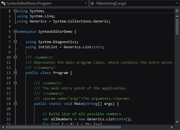
SyntaxEditor
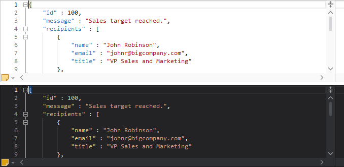
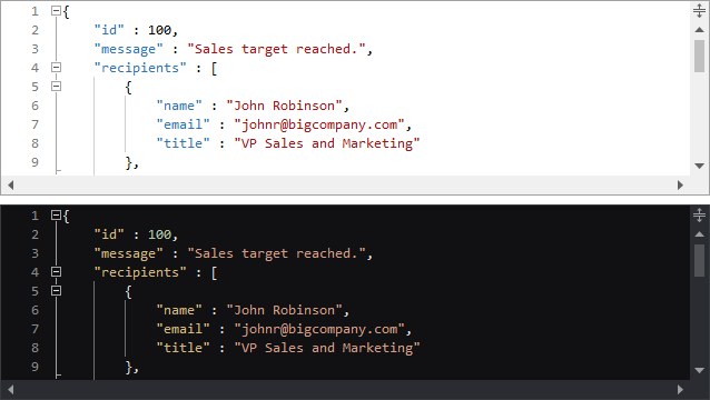
Light and Dark Themes
It’s easier than ever to support switching between light and dark themes in SyntaxEditor. A new class helps orchestrate updating SyntaxEditor UI elements, highlighting styles, and icon sets when toggling between light and dark themes.
A SyntaxEditor light theme (above) and dark theme (below)
All Actipro-provided syntax languages now include both light and dark highlighting styles, and we automatically convert many popular light-themed colors to appropriate dark-themed colors for custom languages that have yet to be updated with explicit dark styles.
Highlighting Styles
The current line number is now highlighted in a different style than other line numbers, so the default line number colors have been updated to better suit this feature.
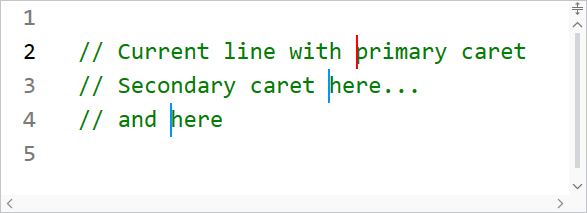
Multiple carets and current line highlighting
When using multiple carets while editing, the primary caret now has a more distinctive appearance than secondary carets.
Several other highlighting styles have also had their default values tweaked.
.NET Languages Add-on
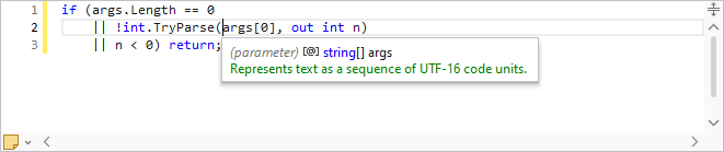
The C# parser grammar has been updated to support C# 9.0 syntax, including everything from top-level statements to records and improved pattern matching.
A C# document with top-level statements
Resolver support has been improved for local functions.
Documentation comments display in IntelliPrompt now supports <para> and <br/> tags for paragraph and line breaks.
.NET 8 Support
The WPF Controls officially support .NET 8 with this release.
UIA peers have been updated and added for numerous controls to better support accessibility updates in .NET 8.
Sample Browser
The Sample Browser application has been updated to use an SDK-style project and target .NET 6.
This version adds a new Visual Studio Blue renderer, makes major improvements to SyntaxEditor’s ability to support light and dark themes, improves the SyntaxEditor .NET Languages Add-on, and much more.
See the related announcement post for the detailed list of enhancements and updates.
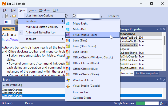
Some of the renderers for the various WinForms controls have been refactored with a more modern appearance, such as with glyphs for the status bar gripper and menu item checks.
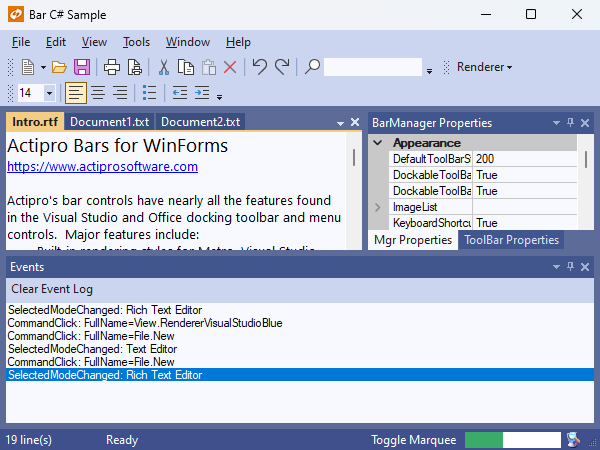
The new Visual Studio Blue theme
A new Visual Studio Blue renderer has been added that mimics the look of the Visual Studio 2022 Blue theme.
SyntaxEditor Light and Dark Themes
It’s easier than ever to support switching between light and dark themes in SyntaxEditor. A new class helps orchestrate updating SyntaxEditor UI elements, highlighting styles, and icon sets when toggling between light and dark themes.
A SyntaxEditor light theme (above) and dark theme (below)
All Actipro-provided syntax languages now include both light and dark highlighting styles, and we automatically convert many popular light-themed colors to appropriate dark-themed colors for custom languages that have yet to be updated with explicit dark styles.
SyntaxEditor Highlighting Style Updates
The current line number is now highlighted in a different style than other line numbers, so the default line number colors have been updated to better suit this feature.
Multiple carets and current line highlighting
When using multiple carets while editing, the primary caret now has a more distinctive appearance than secondary carets.
Several other highlighting styles have also had their default values tweaked.
SyntaxEditor .NET Languages Add-on Updates
The C# parser grammar has been updated to support C# 9.0 syntax, including everything from top-level statements to records and improved pattern matching.
A C# document with top-level statements
Resolver support has been improved for local functions.
Documentation comments display in IntelliPrompt now supports <para> and <br/> tags for paragraph and line breaks.
Sample Browser
The Sample Browser application has been updated to use an SDK-style project and target .NET 6.
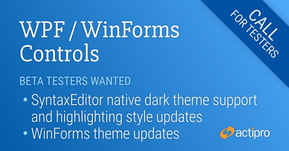
We’ve been hard at work with several new features for v24.1 of our WPF and WinForms products and are asking for beta testers to work with preview builds of what is coming to help ensure a smooth transition.
Beta testers will get an early look at the new features and can give us valuable feedback to influence any necessary development and/or bug fixes prior to the final release. See the notes at the end of this post for details on signing up as a beta tester.
SyntaxEditor Native Dark Theme
SyntaxEditor now has built-in support for switching between light and dark themes. Previously, only UI element brushes were updated for dark themes, but the highlighting styles and icon sets had to be manually transitioned.
Now, a new SyntaxEditorThemeManager class and individual light/dark color palettes for a highlighting style registry allow for any change in the global theme to be automatically reflected in SyntaxEditor.
All Actipro-provided languages have been updated, as appropriate, with both light and dark highlighting styles, and we automatically convert many popular light-themed colors to appropriate dark-themed colors for custom languages that have yet to be updated with explicit dark styles.
SyntaxEditor Highlighting Style Updates
A new feature enables the current line number to be highlighted in a different style than the other line numbers, so the default line number colors have been updated to coordinate with this new feature.
When editing with multiple carets, distinct colors can now be defined for the primary and secondary carets.
Several other highlighting styles have also had their default values tweaked.
Theme Updates (WinForms Only)
A new Visual Studio Blue theme is available that mimics the Visual Studio 2022 Blue theme.
The renderers for Metro Light and Dark have been updated with a more modern gripper for the status bar and more subtle checked icons for checkable menu items that do not provide their own icon. Several classic renderers have also been renamed for clarity.
Beta Testers
We are looking for beta testers who:
Will actively use supplied preview builds to help ensure the beta is stable.
Will report suggestions for improvement of new features.
Will report confusion or missing information from conversion notes.
Will report any bugs that are encountered.
Ideally are signed up in our Slack workspace, as it’s easiest to communicate through that during testing phases.
Please contact our support team privately via a ticket to sign up for beta testing:
Avatar controls are used to represent people or objects. They can render a full-size image, a centered glyph, a person's initials, or text.
Empty, initials, and image avatars
When text is provided, initials can automatically be derived. Large text-based content will scale down to try and fit within the circle as needed. A generic "empty" glyph will be displayed when no avatar content is provided.
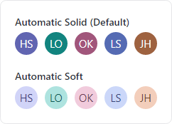
Solid and soft appearances, showing how different initials derive various color combinations
An avatar is most distinctive when using image-based content, so text-based content can be harder to differentiate. While an avatar's foreground and background can be manually specified, there is built-in logic to automatically select color combinations based on the avatar's content and using either a solid or soft appearance.
Avatar derives from Button and supports the standard button command model and click events.
AvatarGroup
Use an AvatarGroup to render multiple Avatar controls. Avatars in a group can overlap with each other by a given size percentage, and you can expand the avatars on mouse hover. When the avatars don't fit in the available space, they can overflow to a popup.
An avatar group with an overflow button that when clicked, shows overflowed avatars
Wrap the group in a chromeless button to make an actionable avatar group that executes a task when clicked.
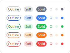
Badge
Badges can add contextual information to target elements, or even used on their own. Badges can display small content like text, counts, icons, or can render as a dot.
Various kinds of badges
When a badge adorns an element, it shows and hides using an animated "pop" effect. It can be easily aligned to any anchor position on the target element.
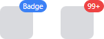
NumericBadge
NumericBadge inherits Badge and supports binding to a numeric value, such as a count value. The badge automatically displays when the count increments to a positive number and hides when decrementing to zero.
Badge and NumericBadge adorning elements
The displayed numeric value has overflow support, meaning that a large value can be restricted to only show "99+" for example.
RingSpinner
The RingSpinner control renders an animated ring where the two ring segment ends chase each other around the circle.
A couple RingSpinner controls
It is used when some form of processing is occurring to tell the end user that something is happening.
Shared Library
RingSlice
The RingSlice shape renders a portion (or the entire circle) of a ring shape. Its start/end angles, radius, thickness, and other stroke properties can be set.
A circular progress bar
Ring slice shapes can be combined in many interesting ways within UI, primarily used to create progress indicators.
 Bill Henning (Actipro)
