Editors for WinRT - TimeEditBox

by Avatar Bill Henning (Actipro)
Wednesday, September 10, 2014 at 8:47am

PostBannerWinRTControlsDevNotes

In the recent posts, we have seen color, enumeration, and date edit boxes, which are all part of the new WinRT/XAML Editors product.  In today's post, we'll take a look at the TimeEditBox controls, which make it easy to select a time value.

Windows Store Variant

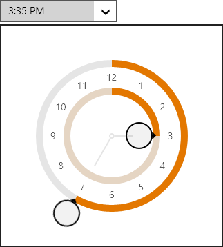
The TimeEditBox control is used to input a DateTime value, and uses a TimePicker control in its popup.

TimeEditBoxOpened

Edit boxes work great with a keyboard.  When the edit box is focused, values can be directly typed in.  Type in "10am", "10:00", "10:00 AM", etc. and press Enter.  Any of those will commit the same time value.  You can also move the caret to one of the time components (hour, minute, second, AM/PM) and use keyboard arrow keys, PgUp/PgDn, or the mouse wheel to increment values.  Best of all, pressing the left/right arrow keys will instantly jump between the various "parts" (components) of the edit box value and select the part's text.

The time value can be displayed in any desired standard or custom format.  By default it will use the current culture's default time format.

If the user doesn't have a keyboard, mouse or touch can be used to display the popup.  The popup contains a TimePicker control, which uses an analog clock-like user interface.  It is comprised of two radial sliders.  The inner slider alters the hour (spin clockwise one cycle to get to PM hours) and the outer slider alters the minute. 

Compare to Native WinRT TimePicker

As shown in the previous post related to date editing, most competitors have either made date/time pickers that show a large Windows Phone-like spinning selector, or have gone with the multiple ComboBox approach like the native WinRT TimePicker control does:

TimePicker

Neither of those control types are ideal for WinRT apps that can potentially be run on large desktops with keyboards.  Compare the design to ours:

TimeEditBoxClosed

Not only does our TimeEditBox use less overall space and reduce UI clutter, it is also super efficient when combined with a keyboard.

Windows Phone Variant

Just like our other edit boxes, this edit box will render itself like a button when used on Windows Phone.  Tapping the button shows a full screen picker (same as above) where the date value can be selected.

Summary

This post shows how an TimeEditBox control can make it simple for an end user to select a time value within a Windows Store or Windows Phone app.  Download our WinRT/XAML Controls to check it out, along with our other beautiful and functional editor controls!

TaskDownload TaskLiveDemo TaskBuyNow

Editors for WinRT - DateEditBox and MonthCalendar

by Avatar Bill Henning (Actipro)
Thursday, September 4, 2014 at 2:49pm

PostBannerWinRTControlsDevNotes

In the last post of this series, we introduced the EnumEditBox control, which is part of the new WinRT/XAML Editors product.  In today's post, we'll take a look at the DateEditBox and MonthCalendar controls, which make it easy to select date values.

Windows Store Variant

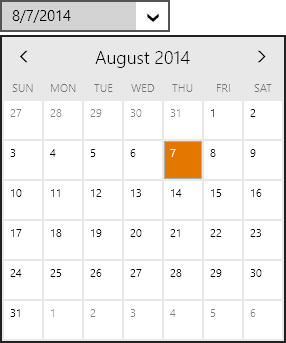
The DateEditBox control is used to input a DateTime value, and uses a DatePicker control in its popup.

DateEditBoxOpened

Edit boxes work great with a keyboard.  When the edit box is focused, values can be directly typed in.  Type in "8/7", "8/7/14", "8/7/2014", etc. and press Enter.  Any of those will commit the same date value.  You can also move the caret to one of the date components (month, day, year) and use keyboard arrow keys, PgUp/PgDn, or the mouse wheel to increment values.  Best of all, pressing the left/right arrow keys will instantly jump between the various "parts" (components) of the edit box value and select the part's text.

DateEditBoxFocused

In this screen, the caret was on the month part and then the right arrow was pressed.  The day part was auto-selected.  A new day value could then be typed in.

The date value can be displayed in any desired standard or custom format.  By default it will use the current culture's default date format.

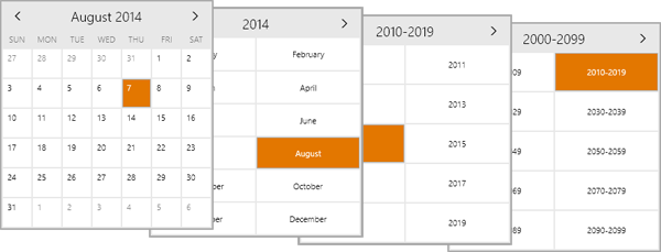
If the user doesn't have a keyboard, mouse or touch can be used to display the popup.  The popup contains a DatePicker control, which defaults to wrapping a MonthCalendar control.  The MonthCalendar control displays a single-month at a time.  The arrows in the header can be used to navigate backward and forward with appealing animated transitions. 

Pressing the title in the header will zoom out to the year.  Pressing it again zooms out to the decade, and then century.  Here's the views:

MonthCalendarViews

Compare to Native WinRT DatePicker

Most competitors have either made date pickers that show a large Windows Phone-like spinning date selector, or have gone with the three ComboBox approach like the native WinRT DatePicker control does:

NativeDatePicker

Neither of those control types are ideal for WinRT apps that can potentially be run on large desktops with keyboards.  Compare the design to ours:

DateEditBoxClosed

Windows Phone Variant

Just like our other edit boxes, this edit box will render itself like a button when used on Windows Phone.  Tapping the button shows a full screen picker (same as above) where the date value can be selected.

Summary

This post shows how an DateEditBox control can make it simple for an end user to select a date value within a Windows Store or Windows Phone app.  Download our WinRT/XAML Controls to check it out, along with our other beautiful and functional editor controls!

TaskDownload TaskLiveDemo TaskBuyNow

Editors for WinRT - EnumEditBox

by Avatar Bill Henning (Actipro)
Wednesday, September 3, 2014 at 12:14pm

PostBannerWinRTControlsDevNotes

In the last post of this series, we introduced the ColorEditBox control, which is part of the new WinRT/XAML Editors product.  In today's post, we'll take a look at the EnumEditBox control, which makes it easy to select enumeration values.

Windows Store Variant

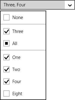
The EnumEditBox control is used to input an Enum value, and uses an EnumPicker control in its popup.

EnumEditBoxOpened

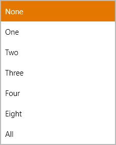
The screenshot above shows off how the popup renders a flags-based enumeration, where multiple selections can be made.  For non-flags enumerations, the popup looks more like a standard single-selection list:

EnumListBoxNonFlags

It's very easy to get going with the control.  Simply set the enumeration type and bind a value and it takes care of the rest for you.

Edit boxes work great with a keyboard.  When the edit box is focused, values can be directly typed in.  Type in "Three" and press Enter.  The value will get committed.  You can also use keyboard arrow keys, PgUp/PgDn, or the mouse wheel to increment values.

If the user doesn't have a keyboard, mouse or touch can be used to display the popup.  The picker on the popup uses large items, making for easy mouse/touch selection.

Anther great feature of the control is the ability to use DisplayAttribute attributes on the enumeration values to specify alternate display text for each enum value.  Custom value sorting algorithms can be set as well.

Windows Phone Variant

Just like our other edit boxes, this edit box will render itself like a button when used on Windows Phone.  Tapping the button shows a full screen picker (same as above) where the enum values can be selected.

Summary

This post shows how an EnumEditBox control can make it simple for an end user to select an enumeration value within a Windows Store or Windows Phone app.  Download our WinRT/XAML Controls to check it out, along with our other beautiful and functional editor controls!

TaskDownload TaskLiveDemo TaskBuyNow

Editors for WinRT - ColorEditBox

by Avatar Bill Henning (Actipro)
Tuesday, September 2, 2014 at 12:13pm

PostBannerWinRTControlsDevNotes

In the last post, we gave an overview of the new edit box controls that were just released in our WinRT/XAML Editors product, including a list of some options that are available in all edit boxes.  In today's post, we're going to take a look at a universal edit box control that is used to select a color value.

Windows Store Variant

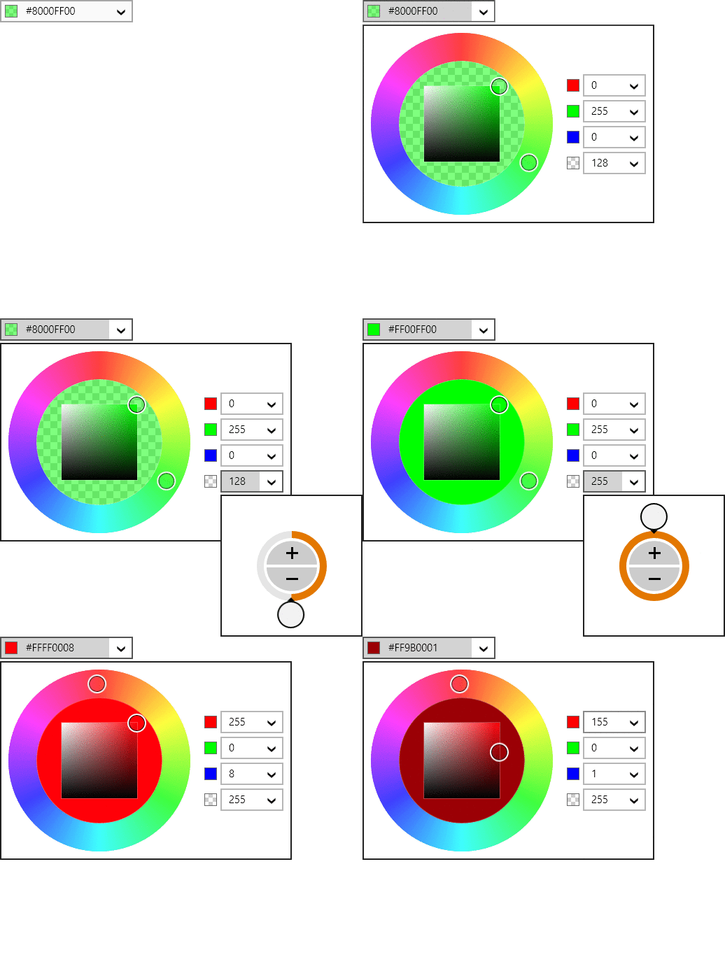
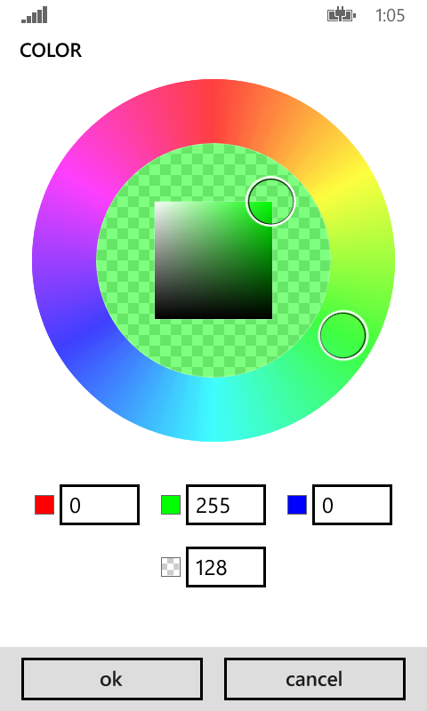
The ColorEditBox control is used to input a Color value, and uses a ColorPicker control in its popup.

ColorEditBoxWindows

The alpha component of the color can optionally be included.  When the alpha component is not enabled, an opaque color is required and only RGB edit boxes appear on the popup, instead of ARGB.

Edit boxes work great with a keyboard.  When the edit box is focused, values can be directly typed in.  Type in "Red", "#f00", or "#ff0000" and press Enter.  Any of those will commit a red color value.  You can also move the caret to one of the ARGB components and use keyboard arrow keys, PgUp/PgDn, or the mouse wheel to increment values.

If the user doesn't have a keyboard, mouse or touch can be used to display the popup.  Just drag the sliders to select a different color.  Or edit the ARGB component values directly to set exact values.

Windows Phone Variant

All of our WinRT/XAML controls are universal and support both Windows Store and Windows Phone apps.  In the case of edit boxes, they often have a different UI that has been tailored specifically for Windows Phone.

ColorEditBoxPhoneClosed

Above we see how a ColorEditBox renders on a phone.  Since phones don't have hardware keyboards, the control has been crafted to look like a native ComboBox, although we also support an optional clear button.  Then rest of the control behaves like a button.  When the button is tapped, this full screen dialog is displayed:

ColorEditBoxPhoneOpened

Everything on the picker popup displayed here is big and touch friendly… a perfect design for color selection on Windows Phone.

Summary

This post shows how a ColorEditBox control can make it simple for an end user to select a color within a Windows Store or Windows Phone app.  Download our WinRT/XAML Controls to check it out, along with our other beautiful and functional editor controls!

TaskDownload TaskLiveDemo TaskBuyNow

Editors for WinRT - Edit Boxes Overview

by Avatar Bill Henning (Actipro)
Thursday, August 28, 2014 at 10:18am

PostBannerWinRTControlsDevNotes

In today's post, I'd like to give an overview of how edit boxes in our new WinRT/XAML Editors product work, and why we created them.

What Are Edit Boxes?

Edit boxes are controls that allow for the editing/selection of common data type values. Unlike many other third party editor controls, the Actipro Editors have been specifically designed to work great for whichever form of input (keyboard, mouse, or touch) is utilized by the end user.

DateEditBoxFocused

They are designed to visually fit right in with the standard Windows Store and Windows Phone controls.  Each editor's main appearance is similar to a standard TextBox, where the value can be typed in via a keyboard for maximum efficiency. Certain keyboard keys and the mouse wheel can often be used to increment/cycle values.  Custom validation and conversion logic between text and real object values can even be injected.

Most editors also contain a default popup picker that is geared for mouse and touch-based input. The popup can easily be invoked by tapping the edit box's drop-down button.

DateEditBoxOpened

Controls List

ColorEditBoxClosed

ColorEditBox - Allows for the input of a Color value.

CornerRadiusEditBoxClosed

CornerRadiusEditBox - Allows for the input of a CornerRadius (top-left, top-right, bottom-right, bottom-left) value.

DateEditBoxClosed

DateEditBox - Allows for the input of a DateTime value's date component.

DateTimeEditBoxClosed

DateTimeEditBox - Allows for the input of a DateTime value.

DoubleEditBoxClosed

DoubleEditBox - Allows for the input of a Double (floating-point number) value.

EnumEditBoxClosed

EnumEditBox - Allows for the input of a Enum (flags and non-flags enumeration) value.

GuidEditBox

GuidEditBox - Allows for the input of a Guid (unique ID) value.

Int32EditBoxClosed

Int32EditBox - Allows for the input of an Int32 (integer) value.

PointEditBoxClosed

PointEditBox - Allows for the input of a Point (X, Y) value.

RectEditBoxClosed

RectEditBox - Allows for the input of a Rect (X, Y, width, height) value.

SizeEditBoxClosed

SizeEditBox - Allows for the input of a Size (width, height) value.

ThicknessEditBoxClosed

ThicknessEditBox - Allows for the input of a Thickness (left, top, right, bottom) value.

TimeEditBoxClosed

TimeEditBox - Allows for the input of a DateTime value's time component.

Options Galore

Edit boxes all support nullable values, meaning that a DateEditBox for example returns a value of Nullable<DateTime>.  An option can be set to require that a non-null value is set.

The editors can be set to provide read-only display of data.  When not read-only and if nulls are allowed, a clear button appears when the control has focus.

The popups for the edit boxes can be fully customized.  Each editor also supports placeholder text and optional header content.

Summary

This is just an introduction to what the edit boxes can do.  In our next series of posts, we'll take a look at each edit box control and its related popup picker in detail.

TaskDownload TaskLiveDemo TaskBuyNow