 Bill Henning (Actipro)
-
Bill Henning (Actipro)
-
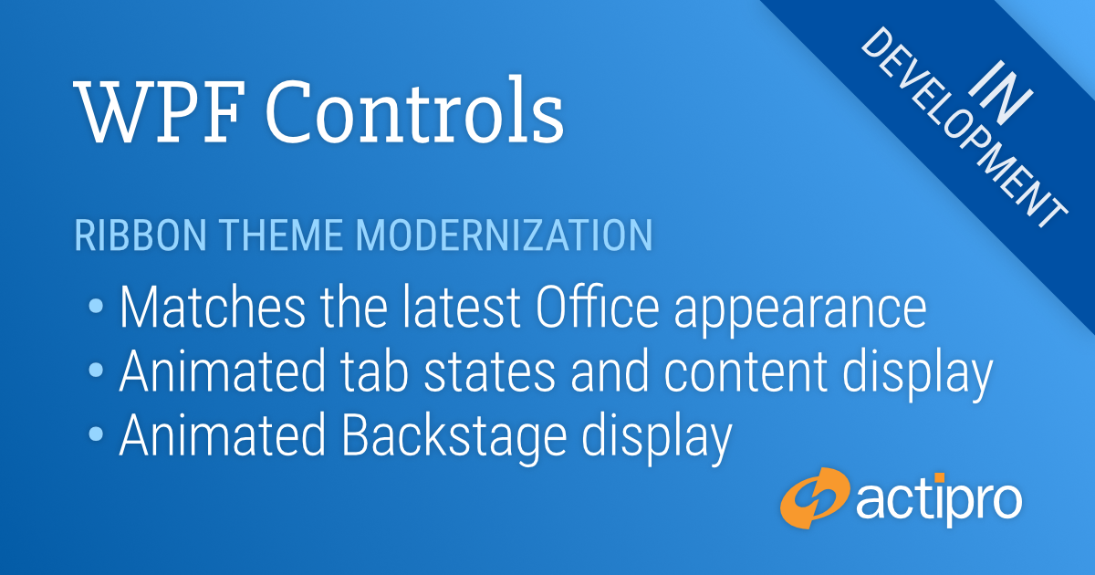
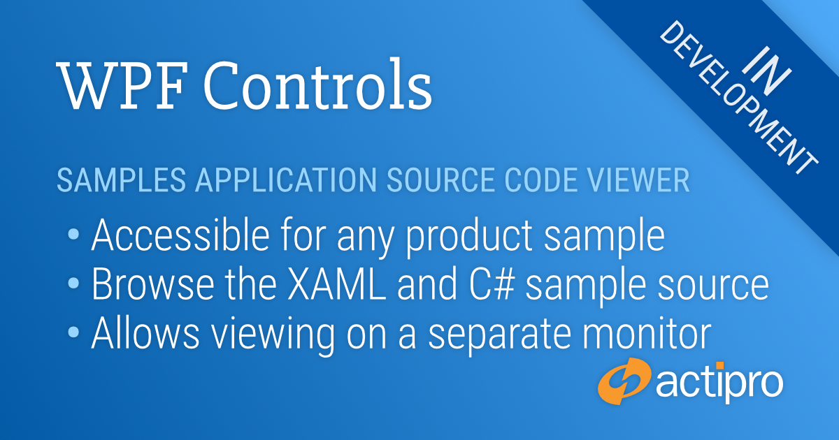
Actipro WPF Controls v2020.1 development is in progress, and the new version’s main goals are to modernize our UI control features/themes, and make theme customization much easier.
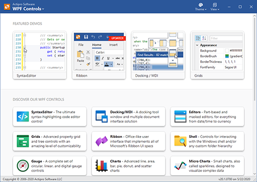
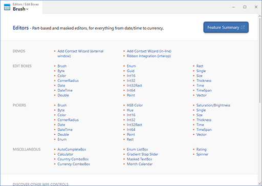
In the previous post, we took a look at our redesigned WPF samples application that will launch in the 2020.1 version. The new design focuses on a modern aesthetic that makes great use of our themes-related updates for v2020.1.
One of the user comments in that post was that it would be great to support viewing of the sample’s code right from within the application. This is something we also planned on adding, so let’s see what that feature looks like.
Viewing Sample Code
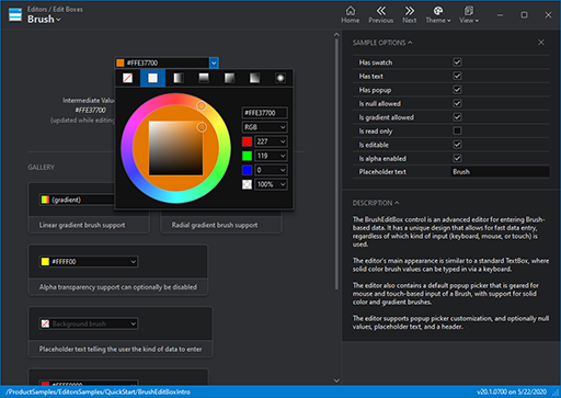
When you navigate to a sample, a “View Source Code for This Sample” menu item is available. We also have added a status bar button with a “</>” glyph that accesses the same feature.
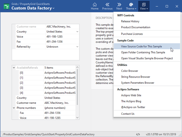
When clicked, the Source Code Viewer window will open and the selected sample’s main XAML code will be displayed by default.
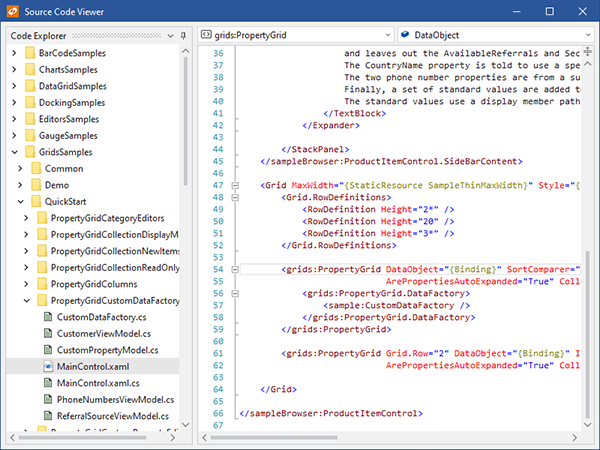
The Source Code Viewer window opens as a separate window so that if you have a multi-monitor setup, you can display the code on a different monitor from the samples application itself.
The Source Code Viewer window has the full sample source folder hierarchy on the left. Select a different file from the same sample or a different sample altogether to see additional source code.
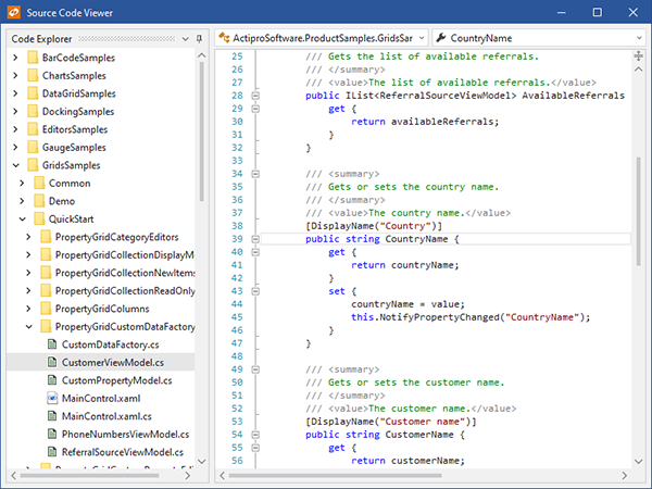
Here we’ve selected a view-model C# class for the same sample.
Summary
This Source Code Viewer is a great example of combining multiple Actipro WPF products (Docking/MDI, Shell, and SyntaxEditor) together in a simple way to implement a professional-looking code explorer. We think this new feature in the v2020.1 samples application will be a real time-saver for our customers when wanting to learn more about how to use our WPF Control products.
Post in the comments below if you have any feedback or questions about the new Sample Code Viewer.