While the version includes a wide number of small updates and bug fixes, let’s take a look at a handful of the larger updates. We are continuing to work on wrapping up the massive 2020.1 version that is currently in beta testing.
Docking/MDI
A new TabDragReordered was added to AdvancedTabControl that fires after a tab is reordered with internal drag/drop.
The UI automation peer tree was improved to better support auto-hidden tool windows.
A new Shift+Esc hotkey now closes the active tool window.
Editors
DatePicker, DateTimePicker, and TimePicker were updated to support null values and a new Clear button can appear on MonthCalendar when nulls are allowed.
Numeric edit boxes now parse whitespace within custom format string literals better.
Improved various portions of Calculator's logic.
Improved the MaskedTextBox caret-moving logic.
Grids
Improved the performance in PropertyGrid and tree controls in a couple scenarios.
Shell
Added new ShellListView properties that can control how the control is sorted.
Significantly improved the speed by which ShellListView can sort Windows shell objects by property.
SyntaxEditor
Improved the "Adornments - Squiggles Intro" Quickstart to show a more realistic scenario of tracking developer-specified tagged ranges.
Improved the performance of the CollectionTagger.Clear method when there are a small number of tags.
Actipro WPF Controls v2020.1 development is in progress, and the new version’s main goals are to modernize our UI control features/themes, and make theme customization much easier.
In our previous post, we talked about the new WPF theme generation system that we’ve developed for v2020.1, and its theme definitions that have options for customizing themes.
In today’s post, we’ll introduce the new WPF Theme Designer application that comes with the WPF Controls and provides a visual way to customize theme definitions.
Theme Definitions
As described in our previous post, theme definitions have over 50 options that are used by our theme generator to output asset resources such as brushes, thicknesses, etc. into resource dictionaries that provide a WPF theme. The generated theme is used by Actipro controls and optionally native WPF controls to render your application’s UI consistently throughout. You can also reuse any of our generated asset resources in your UI via DynamicResource calls.
Customizing Theme Definition Options
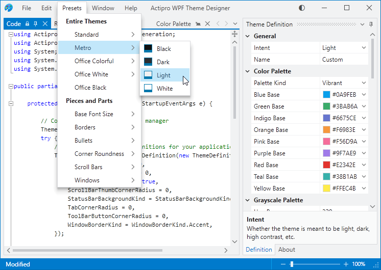
Our main goals for the WPF Theme Designer application were to make it easy to visualize and customize theme definitions. The application provides numerous "entire-theme preset" menu items that initialize a theme definition based on one of our pre-defined themes:
The WPF Theme Designer application with a theme based on Metro Light
Here you see the app using the selected theme preset, and with its Code document open. The Code document lists App.OnStartup code that you can paste into your own application to replicate the same theme in your application.
The Theme Definition tool window on the right contains a property grid where you can fully customize the many theme definition options. When a theme definition option is changed, the Code document’s text is updated appropriately to set non-default values.
On top of that, the app also immediately generates a new theme and applies it so you get instant feedback on how theme definition options affect the appearance.
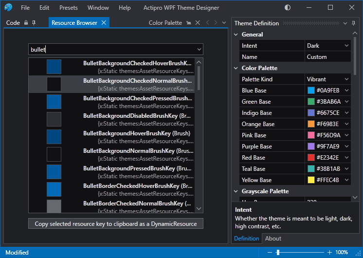
Let’s change the Intent to Dark and look at the Resource Browser document…
The WPF Theme Designer application after switching to Dark theme intent
The Resource Browser document contains a complete list of the asset resources that are generated by the theme definition. Type in text in the filter box at the top to look for specific asset resources. In this case, we’ve typed “bullet” to look for asset resources related to checkbox and radio buttons.
If you wish to reuse an asset resource in your application, simply click the button to copy a DynamicResource to the asset’s resource key and paste that in your XAML.
For instance, if we wanted a general low-contrast container background brush to use in a Border in our application, we’d copy a DynamicResource to ContainerBackgroundLowBrushKey and would paste it into our XAML like:
This is a first look at the WPF Theme Designer application. We’ll follow up soon with additional information on its many other features.
Post in the comments below with any questions or comments on the WPF Theme Designer application.
Beta Testers Wanted
We have started beta testing v2020.1. If you would like to assist us in testing, please write us at our support address. We would like individuals who are already licensed for the 2019.1 version, are willing to use beta versions of 2020.1 (.NET Core or .NET Framework), and who want to provide feedback, especially in the area of our themes updates.
Actipro WPF Controls v2020.1 development is in progress, and the new version’s main goals are to modernize our UI control features/themes, and make theme customization much easier.
In our previous post, we talked about how we will be bringing .NET Core builds of our WPF Controls in v2020.1, along with publishing NuGet packages.
In today’s post, we’ll start to dive into one of the largest areas of the themes-related updates for this version, which is the new theme generation system.
Generated Themes
The Actipro WPF controls provide numerous complete pre-defined themes that render similar to various Windows and Office versions. These themes apply to Actipro and optionally native WPF controls as well so that there is consistency throughout your application’s appearance. While this system has always worked well, the current pre-defined themes are somewhat difficult to customize.
We wanted to take themes to the next level for the new version, and we have truly built something fantastic.
What we came up with is a framework where you can configure numerous options on a theme definition object. When you register that theme definition with our ThemeManager, you then can apply that theme at any time with a single line of code. Multiple theme definitions can be registered, allowing you to register “light” and “dark” themes (or any other variant you like) and instantly toggle between them at run-time.
An example of native controls themed in an Office White theme with Orange accents
When a theme definition is applied, instead of simply merging pre-defined resource assets (brushes, thicknesses, etc.) into the Application.Resources as before, we dynamically construct hundreds of resource assets very quickly and merge them into Application.Resources. The resource assets that are created are based on the options in the theme definition, and are generated in a fraction of a second.
Like now, we still provide themes that render similar to Windows and Office. We register theme definitions for those, among others, by default with the ThemeManager so they can be applied at any time with a single line of code.
Customizing Themes
Say that you love our Office Colorful Indigo theme (Word-like appearance), but you don’t like how it has grayscale background state hover/pressed effects for toolbar and menu items. In the past, this would be difficult to change... but not any more. You can get the default theme definition we provide for this theme, adjust an option on it to use accent colors for toolbar/menu state backgrounds, and when the new theme definition is applied, you’ll see the adjusted appearance in action.
What happens behind the scenes is that our theme generation logic adheres to the options you specify, and the brush resource assets that it creates for toolbar/menu state backgrounds are generated with accent color values instead of grayscale color values.
Theme Definition Options
How many options are there for theme definitions? At the time of this writing, we have well over 50 options so far and are adding more as we work towards wrapping up the first beta build of v2020.1.
You can control all kinds of things with theme definitions options, including color palette, border contrast, bullet appearance, font size, corner radius, window appearance, and much more.
Beta Testers Wanted
We are approaching a point where we’re like to start collecting a list of beta testers for the 2020.1 version, who can start working with the new features soon. If you would like to assist us in testing, please write us at our support address. We would like individuals who are already licensed for the 2019.1 version, are willing to use beta versions of 2020.1 (.NET Core or .NET Framework), and who want to provide feedback, especially in the area of our themes updates.
Summary
We’re just scratching the surface here of what you can do with the new theme definitions. We haven’t even shown off the new Theme Designer app yet. We’ll continue to dive into the area of theme generation in upcoming blog posts. Stay tuned!
Post in the comments below with any questions or comments on theme generation.
Actipro WPF Controls v2020.1 development is in progress, and the new version’s main goals are to modernize our UI control features/themes, and make theme customization much easier.
In our previous post, we took a look at a new mechanism in our primary WPF Controls samples app to quickly search for samples.
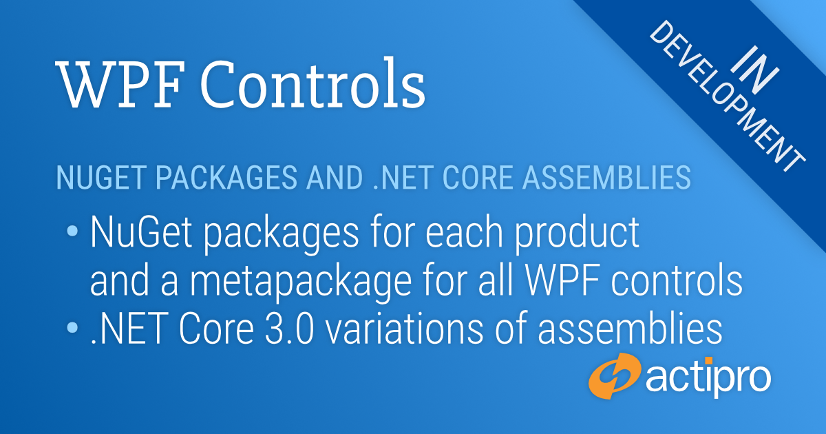
Today's post will focus on some infrastructure updates we've been working on to bring not only NuGet feeds, but also .NET Core builds of our WPF controls in v2020.1.
NuGet Package
Many customers have asked for NuGet package feeds of our WPF Control assemblies so they can reference the feeds in their applications and not have to manually update assembly references when moving to new versions. By using NuGet feeds, the versions can be easily managed through Visual Studio's NuGet Package Manager.
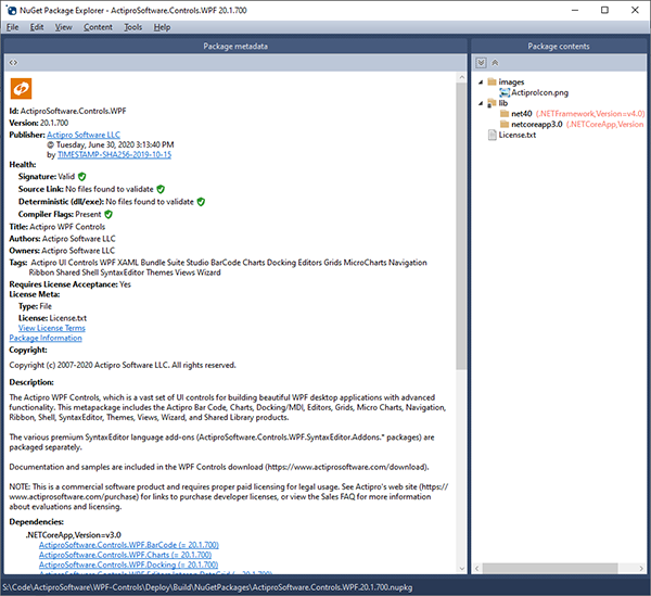
We are still finishing it all up, but here's a preview of an Actipro WPF Controls metapackage (a NuGet package that includes other individual Actipro product packages) as seen in the NuGet Package Explorer app.
The NuGet package for all the WPF controls in WPF Studio
Our eventual plan is to publish the 20+ Actipro WPF Control packages to nuget.org so that it's simple to find and use them.
Before we get there and while doing final testing on this mechanism, we may start with a ZIP of our NuGet packages that you can download from your Actipro account and place in a private NuGet server to get started.
.NET Core Builds
As .NET Core gains momentum and popularity, we will be there with native .NET Core builds of our WPF Control products, starting in v2020.1.
While the traditional WPF Controls installer you download from our site will still only include .NET Framework versions of the assemblies (for now), as mentioned above, we will make a ZIP available with our NuGet packages. These NuGet packages will target the traditional .NET Framework and also .NET Core 3.0.
Thus you'll be able to reference these NuGet packages in your .NET Core app projects to use pure .NET Core-based Actipro assemblies.
Summary
Both of these updates have been highly requested by our customers. We recognize that adding them is delaying the release of v2020.1 a bit, but we want to make sure we get all of this right.
As far as timelines go, we still have some work left on finalizing the implementation of the above. Part of this is moving to a new VS designer object model for the .NET Core variations of the WPF control designer functionality. Once that effort is complete and we've completed some additional adjusting of our themes system based on alpha testing, we will ask for beta testers to participate in a closed beta.
v2020.1 is shaping up to be an enormous release. The blog hasn't even really gotten into the new theme generation features yet, or the new Theme Designer application. Watch for blog posts on those soon.
Post in the comments below with any questions or comments on the NuGet feeds and .NET Core builds.
Actipro WPF Controls v2020.1 development is in progress, and the new version’s main goals are to modernize our UI control features/themes, and make theme customization much easier.
In our previous post, we showed how our WPF samples application will be getting an integrated Source Code Viewer for browsing our samples source code. This feature was suggested by a customer.
Another customer feature suggestion was for a way to quickly search for samples. We are also adding this in the 2020.1 samples application.
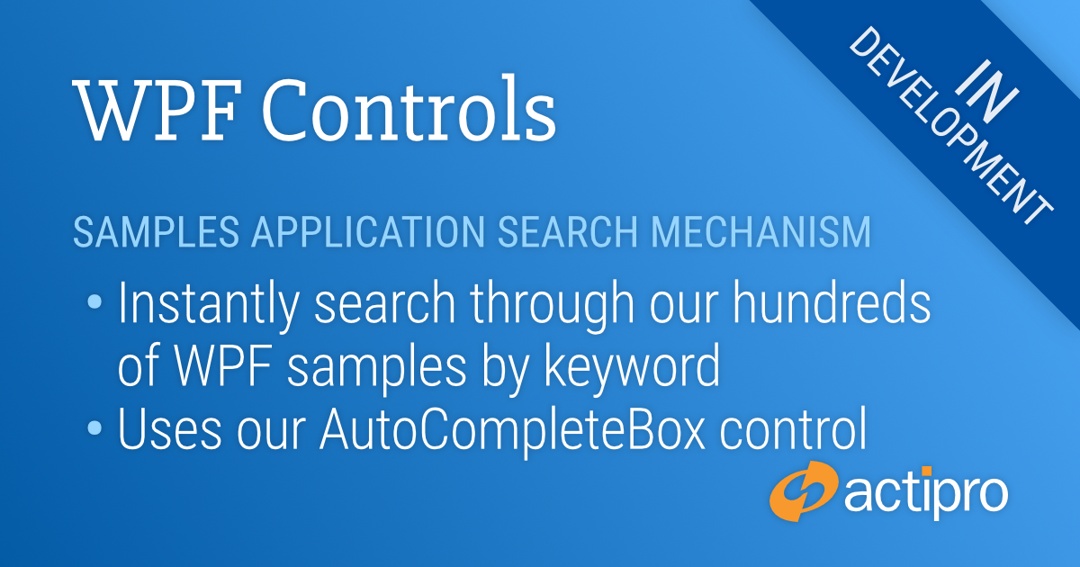
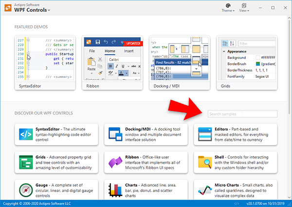
Searching for Samples
We’ve used the AutoCompleteBox in our WPF Editors to implement search functionality for locating samples.
The new "Search samples" box
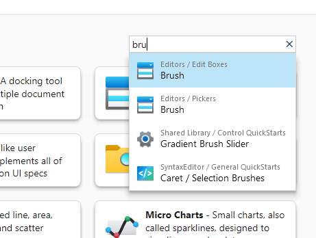
Simply type in text in the search box and a list of results will appear.
The popup showing samples with "bru" in their titles
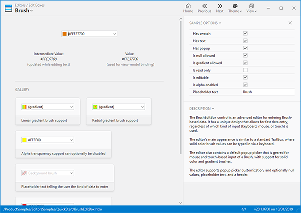
Select a result and the related sample will appear.
After selecting a sample, it immediately loads up
Summary
We appreciate all the customer feedback and hope this new v2020.1 feature will help you find what you are looking for faster than ever.
Post in the comments below if you have any feedback or questions about the new samples search mechanism.
 Bill Henning (Actipro)